How to create Avatar Maker in Next JS and React ?
Things that you will learn in this tutorial :
-
We will be making an avatar maker or avatar generator from Scratch.
-
Designing our avatar in SVG and building variant elements that can be changed by the user.
-
Building a client-side React application that will serve the purpose of Avatar builder.
-
Sending SVG from the Server, or using API to create SVG which you can use as a source in your image tags.
Git repo here: https://github.com/biomathcode/avatarmaker
Here is what it looks like:

1. Designing your avatar
You can use any application that can export an illustration in SVG. We will build elements and their variants that can be changed by the user.
I will be building the emoticon Avatar, which is simple and easy. You can increase the complexity based on your illustration or drawing skills.
I will use Figma.
Here is the final Figma File:
https://www.figma.com/file/VB1vWRMmMOskDxc5WAYWCt/AvatarMaker?node-id=0%3A1
Step to create an Emoticon
a. Draw an ellipse - head
b. Draw two more small ellipses - eyes
c. Draw a middle ellipse - mouth

Similarly, You can change the mouth ellipse shape with other shapes, to create more variants for an emoticon.
These are our “Elements”

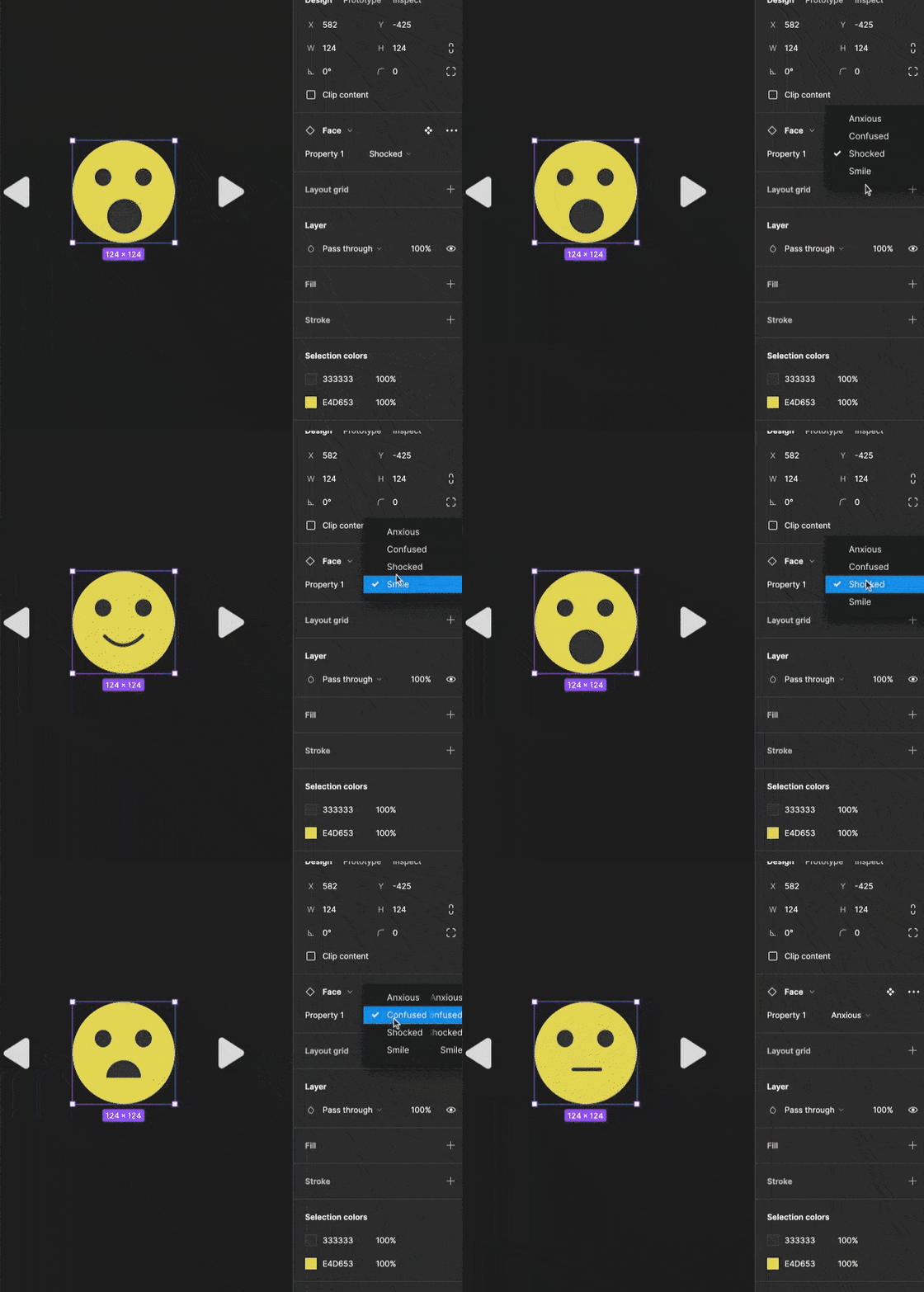
Figma Tips: Creating a component with multiple variants.
-
Select your element and left-click to create a component ( options + command + k on mac)
-
Name the element as, ElementName/Property
In our case, We will name it Face/emotionType
c. Select all Variants and click Merge as variants

2. Creating BoilerPlate for Nextjs.
Run in the terminal. I have added the typescript flag. not necessary though.
mkdir avatermaker
cd avatermaker
npx create-next-app --ts .
Let’s create a component folder, where we will have our Icons.tsx components.
mkdir components3. SVG to JSX
visit: https://svg2jsx.com/ and convert your SVG to JSX. 🤯
Now, if you look head and the eyes for the SVG remain the same. The mouth creates different emotion variants for our emoticons.
We will create a data JSON with your different emotions variant names as keys and their shape or path as value:
const data = {
  Shocked: <circle cx="63" cy="92" r="21" fill="#333"></circle>,

  Confused: <path fill="#333" d="M83 92a21.001 21.001 0 00-42 0h42z"></path>,
  Anxious: (
    <path
      stroke="#333"
      strokeLinecap="round"
      strokeWidth="4"
      d="M47 82L80 82"
    ></path>
  ),
  Smile: (
    <path
      stroke="#333"
      strokeLinecap="round"
      strokeWidth="4"
      d="M39 79c15.5 15.5 31 14 46-1"
    ></path>
  ),
};
Our Icon component will have one prop, which will determine which emotion the emoticon will show.
type Emotion = 'Smile' | 'Anxious' | 'Shocked' | 'Confused'

export function Icon({ emotion }: {
  emotion: Emotion
}  ) {
  return (
    <svg
      xmlns="http://www.w3.org/2000/svg"
      width="124"
      height="124"
      fill="none"
      viewBox="0 0 124 124"
    >
      <circle cx="62" cy="62" r="62" fill="#E4D653"></circle>
      <ellipse cx="37" cy="44.5" fill="#333" rx="10" ry="10.5"></ellipse>
      <ellipse cx="86" cy="44.5" fill="#333" rx="10" ry="10.5"></ellipse>
      {data[emotion]}
    </svg>
  );
}
4. State Management and Styles
Here are some simple helper classNames that will be enough for us. Add this to your styles/global.css file
html,
body {
  padding: 0;
  margin: 0;
  font-family: -apple-system, BlinkMacSystemFont, Segoe UI, Roboto, Oxygen,
    Ubuntu, Cantarell, Fira Sans, Droid Sans, Helvetica Neue, sans-serif;
    background: #1e1e1e;
}

a {
  color: inherit;
  text-decoration: none;
}

* {
  box-sizing: border-box;
}

.flex {
  display: flex;
}
.center {
  align-items: center;
  align-content: center;
}

.gap-10 {
  gap: 10px;
}

.white {
  color: white;
}

.se {
  justify-content: space-evenly;
}

.btn {
  border: none;
  background: #1e1e1e;
  cursor: pointer;
}

.btn:hover {
  background: #101010;
}

.mt-10 {
  margin-top: 10px;
}

.mt-30 {
  margin-top: 30px;
}

.blue {
  color: lightblue;
}
Add RIghtArrow and LeftArrow SVG in the components/Icons.tsx file, which we will use to toggle our emoticon variants.
export function RightArrow() {
  return (
    <svg
      xmlns="http://www.w3.org/2000/svg"
      width="32"
      height="38"
      fill="none"
      viewBox="0 0 32 38"
    >
      <path
        fill="#D9D9D9"
        d="M29.237 15.631c2.458 1.573 2.458 5.165 0 6.738L6.157 37.143C3.493 38.847 0 36.935 0 33.773V4.227C0 1.065 3.494-.847 6.156.857l23.08 14.774z"
      ></path>
    </svg>
  );
}

export function LeftArrow() {
  return (
    <svg
      xmlns="http://www.w3.org/2000/svg"
      width="32"
      height="39"
      fill="none"
      viewBox="0 0 32 39"
    >
      <path
        fill="#D9D9D9"
        d="M2.263 16.131c-2.458 1.573-2.458 5.165 0 6.738l23.08 14.774c2.663 1.704 6.157-.208 6.157-3.37V4.727c0-3.161-3.494-5.073-6.157-3.369L2.264 16.131z"
      ></path>
    </svg>
  );
}
Now, let’s add state management and simple toggle buttons .
import type { NextPage } from "next";
import Head from "next/head";
import styles from "../styles/Home.module.css";
import { Icon, LeftArrow, RightArrow } from "../components/Icons";
import { useState } from "react";

export type Emotion = "Smile" | "Anxious" | "Shocked" | "Confused";

const EmotionTypes: Emotion[] = ["Smile", "Anxious", "Shocked", "Confused"];

const Home: NextPage = () => {
  const [state, setState] = useState(0);

//increase state by 1 and if state equals the length of the array, reset state to 0;
  const increase = () => {
    state === Number(EmotionTypes.length - 1)
      ? setState(0)
      : setState((e) => e + 1);
  };

// decrease state by 1 if the state becomes negative, reset state to a max of the array.
  const decrease = () => {
    state <= 0
      ? setState(Number(EmotionTypes.length - 1))
      : setState((e) => e - 1);
  };

  return (
    <div className={styles.container}>
      <Head>
        <title>
          How to create Avatar Maker or Avatar Generator with React || Nextjs
        </title>
        <meta name="description" content="Generated by create next app" />
        <link rel="icon" href="/favicon.ico" />
      </Head>

      <main className={styles.main}>
        <div className="flex se center gap-10">
          <button className="btn" onClick={() => decrease()}>
            <LeftArrow />
          </button>
          <Icon emotion={EmotionTypes[state]} />
          <button className="btn" onClick={() => increase()}>
            <RightArrow />
          </button>
        </div>
        <div className="white mt-10">{EmotionTypes[state]}</div>
      </main>
    </div>
  );
};

export default Home;
5. Setting SVG over the Nextjs API
Our API route api/hello?emo={emotion} will send SVG, here is how it will work
Similarly, we will have a data object that holds information about emotion variants. Make sure that here you using SVG attributes and not JSX attributes for SVG. In our case, change
strokeWidth to stroke-width
strokeLinecap to stroke-linecap
    type Data = string;

    const data = {
      Shocked: '  <circle cx="63" cy="92" r="21" fill="#333"></circle> ',

      Confused:
        ' <path fill="#333" d="M83 92a21.001 21.001 0 00-42 0h42z"></path> ',

      Anxious:
        '<path stroke="#333" stroke-linecap="round" stroke-width="4" d="M47 82L80 82"></path> ',

      Smile:
        ' <path stroke="#333" stroke-linecap="round" stroke-width="4" d="M39 79c15.5 15.5 31 14 46-1"></path>',
    };
    ```

Now, based on the `emo` queries value we will send the desired emoticon.

```ts
import type { NextApiRequest, NextApiResponse } from "next";

type Data = string;

const data = {...}

type Req = "Shocked" | "Confused" | "Anxious" | "Smile";

export default function handler(
      req: NextApiRequest,
      res: NextApiResponse<Data>
    ) {
      const query = req.query.emo as string;
      const emo = query as Req;
      const emotionSvg: string = data[emo];
      const svgdata = `
      <svg
      xmlns="http://www.w3.org/2000/svg"
      width="124"
      height="124"
      fill="none"
      viewBox="0 0 124 124"
    >
    <circle cx="62" cy="62" r="62" fill="#E4D653"></circle>
    <ellipse cx="37" cy="44.5" fill="#333" rx="10" ry="10.5"></ellipse>
    <ellipse cx="86" cy="44.5" fill="#333" rx="10" ry="10.5"></ellipse>
      ${emotionSvg}

      </svg>
      `;
      res.setHeader("content-type", "image/svg+xml");
      res.status(200).send(svgdata); }
    ```

## 6. Adding Link Preview in our index.tsx.

We will add a preview link, where users can route and see their emoticon. The link can also be used by users for adding to other websites.

This is very similar to how  BuyMeACoffee Button works or the ko-fi Button.  You can also, add your name or other information like the number of social media followers, you have.

You can also, add the link in your GitHub repository readme file as well. Obviously, the link has to be HTTPS.

  ```ts

  const Home: NextPage = () => {

  //state logic

  const link = `http://localhost:3000/api/hello?emo=${EmotionTypes[state]}`;
  return (

  	// html
     <a target={"_blank"}
  				rel="noreferrer"
  			  href={link}
  				className="blue mt-30"
     >
            Link Preview
          </a>

  )
  }
Here, is how the complete index.tsx file will look like
import type { NextPage } from "next";
import Head from "next/head";
import styles from "../styles/Home.module.css";
import { Icon, LeftArrow, RightArrow } from "../components/Icons";
import { useState } from "react";

    export type Emotion = "Smile" | "Anxious" | "Shocked" | "Confused";

    const EmotionTypes: Emotion[] = ["Smile", "Anxious", "Shocked", "Confused"];

    const Home: NextPage = () => {
      const [state, setState] = useState(0);

      const increase = () => {
        state === Number(EmotionTypes.length - 1)
          ? setState(0)
          : setState((e) => e + 1);
      };

      const decrease = () => {
        state <= 0
          ? setState(Number(EmotionTypes.length - 1))
          : setState((e) => e - 1);
      };

      const link = `http://localhost:3000/api/hello?emo=${EmotionTypes[state]}`;

      return (
        <div className={styles.container}>
          <Head>
            <title>
              How to create Avatar Maker or Avatar Generator with React || Nextjs
            </title>
            <meta name="description" content="Generated by create next app" />
            <link rel="icon" href="/favicon.ico" />
          </Head>

          <main className={styles.main}>
            <div className="flex se center gap-10">
              <button className="btn" onClick={() => decrease()}>
                <LeftArrow />
              </button>
              <Icon emotion={EmotionTypes[state]} />
              <button className="btn" onClick={() => increase()}>
                <RightArrow />
              </button>
            </div>
            <div className="white mt-10">{EmotionTypes[state]}</div>

            <a
              target={"_blank"}
              rel="noreferrer"
              href={link}
              className="blue mt-30"
            >
              Link Preview
            </a>
          </main>
        </div>
      );
    };
  export default Home;
7. Conclusion.
I hope this tutorial helps you create your own avatar maker in Next . Or at least, give you a step-wise process that you can follow, to make your own.
There are many other features that you can add. A few
-
Add more options other than just the mouth change, such as background colour change, head colour change, etc.
-
Add a button to download the Avatar. There are a lot of libraries for that.
-
You can animate SVG as well.
Okay, let me fade away.
%%[avater-maker-web-story]
